Your cart is empty!
Table
Tables are used to calculate the availability system of the room. Tables can be placed within the map in a way to reproduce the layout of the room.
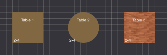
A table can have 3 different types of shape: Rectangle, Circle and Image.
In case a more specific shape is needed, it is possible to use the Image shape by specifying a PNG with transparent background. In this way, it could be possible to reproduce also an irregular polygon.
It is possible to select a table by clicking it. Once a table is selected, the Inspector will start displaying some parameters to change the table appearance and its details. The parameters are split in 2 different sections: Shape and Table.
Shape
The shape fieldset owns parameters that can be used to change the appearance, such as the position of the table, its size and its background.
Position
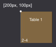
By changing the Position X and Position Y parameters, the selected shape will be automatically repositioned into the map by using the new coordinates. The position of the shapes is represented by the coordinates of the top-left corner.
While changing the position through the Inspector, the table coordinates won't be adjusted in case the Grid Snap setting is enabled. This means that a table can't stay out of the grid bounds.
The shape position can be changed also by dragging the table along the map. While moving the shape, the Inspector parameters will be adjusted in real time according to the new position within the map.
A shape can be moved only when the Selection command is active.
When a table is selected, its position can be adjusted by 1 pixel after pressing the keyboard ARROWS. It is possible to move the shape by 10 pixel by pressing the SHIFT key (⇧) in combination with the arrows.
In case of Grid Snap setting enabled, the shape position will be always adjusted by using the value specified for the Grid Size setting.
Size
By changing the Width and Height parameters, the selected shape will be automatically resized into the map by using the new values.
While changing the size through the Inspector, the table width and height won't be adjusted in case the Grid Snap setting is enabled. This means that a table can't stay out of the grid bounds.
The Circle shape owns instead a parameter to change its Radius, which is equals to the half of the width/height. The width and height of a circle are always proportional.
The shape size can be changed also by dragging one of its edges. While resizing the shape, the Inspector parameters will be adjusted in real time according to the new width and height of the shape.
Diagonal edges (NW, NE, SW, SE) are able to resize both width and height simultaneously. Horizontal edges (WEST, EAST) can resize the shape only in width. Vertical edges (NORTH, SOUTH) can resize the shape only in height.
A shape can be resized only when the Selection command is active.
In case of Grid Snap setting enabled, the shape size will be always adjusted by using the value specified for the Grid Size setting.
Rotation
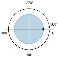
By changing the Rotation parameter, the selected shape will be rotated by using the specified angle (in degrees). The rotation happens clockwise starting from the right side of the shape.
It is possible to specify a rotation value between 0 and 360. These 2 values have the same rotating effect.
In case of circle shapes, only the internal text will be affected by the rotation.
While moving the mouse near to the diagonal edges, the cursor icon will be changed to something similar to a rotating-event. When that icon becomes visible, it is possible to start dragging the shape in order to change its rotation.
Appearance
For all the existing shapes, it is possible to define a Foreground Color, which is used for all the texts within the shape, such as the table name, the table capacity and other information.
Instead, the Background Color can be specified only for rectangle and circle shapes. This color is used to fill the background of the table.
Only for image shapes it is possible to use a picture as background. By using the Background Image media field, it is possible to select one of the available images. Obviously, it is possible to upload new ones through the apposite button.
The Roundness parameter is available only for rectangle shapes. Roundness is the measure of how closely a shape approaches that of a mathematically perfect circle. When this value reaches the half of the width/height, the shape will look like a circle/ellipse.
In a few words, this value can be used to smooth the corners of the rectangle.
Details
Instead, the parameters provided by the table fieldset can be used to define its details, such as the table name and its capacity.
It is possible to edit the Name field to change the name of the selected table. The table name can be at most 16 characters length. The name is always displayed on top-center of the table.
The Minimum Capacity and Maximum Capacity settings define the number of participants that can be hosted by that table, which must be between the specified values (inclusive). The capacity is always displayed on bottom-left corner of the table.
The Can be Shared setting should be used in case the table could host multiple reservations at the same date and time. This technique could be used to merge one ore more tables within a single one. When this options is enabled, an icon will be displayed on bottom-right corner of the table.
It is possible to enable/disable the Published parameter in order to toggle the status of a table. In case a table is unpublished, it won't be visible/bookable from the front-end. While it will still be available for bookings from the back-end. Unpublished tables can be recognized thanks to a light transparency.